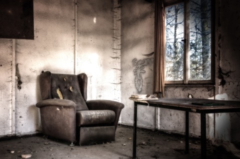
Home is where the heart is. This proverb ideally reflects the essence and importance of home in our lives. Home is not only a place to live but most of all- a shelter from any adversity that meets us in the external world. We say “feel like home” as we believe that at home we are happy, safe and untouchable. It’s our oasis of calm and nobody, and nothing can destroy it.
That’s why, to feel good in our interiors, we design and decorate them in many ways. However, not always can we do that with a sense of style. Sometimes, it happens that we can’t afford to follow the newest trends, and we live in old-fashioned flats. Other times, we exaggerate some designs, relying only on our own taste, not consulting it with, for example, an interior designer, who could give us a hand. In both cases, we are doomed to failure and the laughter of our neighbours and friends. To avoid finding yourself in such an unpleasant situation, we are coming to help with the list of 10 most unwanted home furnishing design, which still exists in some houses.
Cramped spaces
Number one on our list goes to cramped spaces, loaded with a lot of furniture. You may say that there’s nothing wrong with it since it’s the visible sign of maximalism. Yeah, okay- but you don’t want your house to look like a baroque interior of the temple, do you? The pieces of furniture in such flats are usually spaced chaotically, and nothing fits one another. It only gives the impression of the potpourri of random and unwanted objects that someone collected in one room.
Dark colours
Another common faux pas is painting room walls with dark colours. It’s even worse if you put dark furniture inside that room. It makes your space much smaller than it really is. Is it your desirable effect? You may often hear in many TV programmes that you should use light colours, and ideally, hang up some mirrors on the walls to optically expand your interior. So, don’t do the opposite!
Old-fashioned furniture
Okay, if you have already got rid of unnecessary furniture and changed the colour of your walls, it’s high time to replace antique wall units with a modern set of furniture. Why? Because, although these units could be the part of your family heritage, they are behind the times and everyone will tell you the same thing. For sure, they won’t refresh your home design.
Knick-knacks
Next, we’re moving on to knick-knacks, so adored by many of us. Everyone has some favourite bibelots on display in their rooms. Of course, it’s impossible to throw out all of them. But have you ever thought of what we can do to reduce their number? For instance, instead of several bookcases and shelves where we put our favourites, we may invest in more drawers. In this way, if something has great sentimental value for us, can be saved, but in another place.
Mixed designs
Sometimes, people also tend to mix different designs- the old style with modern elements, wood furniture with metal, or plastic trimmings. However, we would instead recommend sticking to only one design, as long as you do up your flat on our own. If you use the help of other professionals, then you can rely on their expertise and taste.
Patterned carpets
Carpets have always been the part of our interior decoration, especially large fitted carpets with many colourful patterns on them. But they went out of style some time ago, and we should remember that! It’s okay if you choose one big plain carpet for the middle of your room or a small rug under your bed, but nothing more. And we say NO to carpets hung up on the walls and carpet toilet bowl covers, which were in use in the 70s and 80s.
Plastic and lace tablecloths
In the past, there was also a strong tendency to put printed plastic tablecloths on our kitchen tables. Some people still do that if they were brought up in the houses where it was cultivated. In the living rooms, instead, people placed lace table covers. Although lace is said to be always in fashion, not all covers suit our interior. Sometimes, it’s even better to leave your table without a cover.
Taxidermy
As fancy as it sounds, taxidermy is preserving of an animal’s body through stuffing for the purpose of display. Such exhibits are usually hung up on the walls so that the owner could boast about their hunting trophies, for example, antlers, or different birds and mammals. Perceived as art by many, it’s nothing else than inhumane exploitation of animals. Moreover, it’s not gracious at all.
Patterned wallpapers
The last but one home furnishing design on our list is a wallpaper. Any of famous interior designers wouldn’t approve of patterned wallpaper, especially flowery one, so popular in the 90s. These days, if you decide on such a decoration, it should be much simpler and usually put only on one or two walls in the room to add charm to the whole design.
Too much art and plants
Eventually, there is the question of paintings and plants in our apartments. Some people are art lovers, and they buy all the masterpieces they come across during shopping. Then, they collect them in a small area so that it looks like an art gallery. The same is with potted plants, which make your interior similar to a palm house. So, next time if you are willing to purchase another beautiful canvas or house plant, think about simplicity and stick to minimalism.
All in all, designing our houses isn’t an easy task. People very often make many common mistakes. However, trying to avoid all these things described in the article will help you to improve your house’s appearance.


